I’ve settled into a general approach to cover art for the TCOTU series. In a nutshell, my goal for each cover is simply to:
- Choose a text color to use everywhere the book is promoted.
- Choose an image that conveys the emotion or elements of the book.
- Have a title, a tagline, my name, and the Book # in the series.
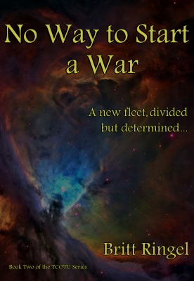
For This Corner of the Universe (see the cover over on the Series page), I think the image has a certain isolated feel, and green of the text and image has the abstract meaning of being new or inexperienced. That applied both to Garrett Heskan and to me I suppose. Contrast this to the cover of No Way to Start a War:
Cover Reveal
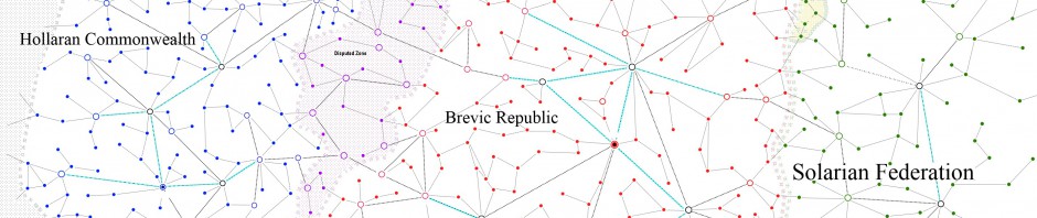
It is turbulent, chaotic and multi-colored. As I’ve said elsewhere, Book 2 has a very different feel than Book 1, and the cover art reflects the change in tone. There is a lot of turmoil in the second book, among warring parties and within the Brevic fleet.
As for an update on the book itself, my wife just did her final continuity check. This week I’ll be re-reading the manuscript for the second to last time, trying to catch any final errors. Then Karen puts it into Kindle format, we side-load it onto our devices, and test the formatting and yes, give it a final read. Nook formatting is easy once the Kindle format is done.
